Crude Oil Leads Bond Yields

Free Chart In Focus email
Delivered to you every week
If you want to know what long term bond yields are going to do, you don’t need some fancy econometric model that incorporates GDP growth, unemployment rates, factory utilization, and all of the many other data series that economists watch.
You just need to watch crude oil prices, and then wait 3 weeks.
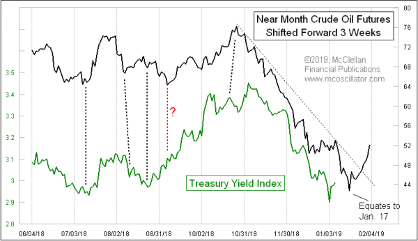
This week’s chart compares the Treasury Yield Index (TYX) to the price of the near month crude oil futures contract. The catch is that the oil price plot has been shifted forward by 3 weeks (actually 16 trading days) in order to reveal how oil’s price movements tend to show up again in bond yields.
Now here is the point in a story when I typically hear critics saying “Correlation Is Not Causation”. Yes, thank you. In response, I say that for the purposes of predicting the direction of interest rates, I don’t really care about causation. I care about indication. Where can I get good answers? If I could find a way to use woolly caterpillars to get a leading indication this good, I’d start a caterpillar farm. But I usually look in data areas that have a better chance of being fruitful.
The big plunge in oil prices from $76/barrel down to $42 is having its echo now in long term bond yields. According to oil prices, there should be one more leg downward for bond yields (upward for bond prices), terminating at a spike bottom for yields ideally due Jan. 17. And then assuming that the reversal in oil prices is a legitimate one (the breaking of the downtrend line is a big clue here), we should expect to see a corresponding rise in bond yields as the echo of that oil price rise.
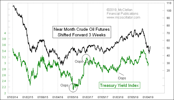
This is not a new phenomenon; it has been going on for several years. Here is a longer lookback, which also reveals one of the important points about this relationship.

This important point is that every once in a while, this relationship goes all screwy and breaks the correlation. It is enough to make a chartist swear off using it, and of course that’s the point. At the moment you conclude it is not working any more, that is when it reverts back into strong correlation again. The other side of that point is that at the moment you are counting the most on it continuing to work perfectly, THAT’s when it goes rogue and breaks correlation.
Another point to understand when using this relationship is that the lag time can vary too. 16 trading days works well right now, but it has been as short as 11 days at times in the past, and it has also stretched into the 20s.
So to summarize, this is one of the coolest leading indication relationships I have come across, AND it is entirely fallible, depending on how badly you want it to continue working as you expect it to. That said, I still look for one more push down for bond yields (up for bond prices) over about the next week. Then the downtrend break seen in crude oil prices should have its echo in long term bond yields.
Tom McClellan
Editor, The McClellan Market Report
May 31, 2018
Waiting on the Echo of Crude Oil’s Big Drop |
Mar 22, 2018
Crude Oil Swooping Up On Schedule |
Jul 21, 2017
Why Are Bond Yields Staying Low? |