DJIA Arriving at the Real Seasonal Peak

Free Chart In Focus email
Delivered to you every week
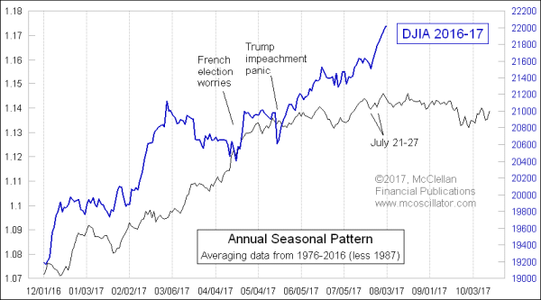
Everyone has heard the old saying about “Sell in May and go away,” but history shows that the period of seasonal strength actually ends around August 1. But it is tougher to come up with a catchy rhyming phrase for that. The question for this year, with such a strong market, is whether the normal seasonal weakness of August and September are really going to matter. Or will the market just power on through?
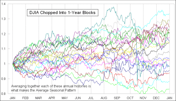
The Annual Seasonal Pattern shown in this week’s chart is made by chopping up historical data into 1-year chunks, and adjusting as needed for strange holidays and other events, such as the market closure for President Ford’s funeral, or Hurricane Sandy, or the closure after the 9-11 attacks. Those one-year chunks of data are then recalculated to express them as a percentage change from the first day of the year. Then they can be averaged together to get the indicator you see here.

I go one step further and exclude the data from 1987. The height of the August 1987 peak and the severity of the October 1987 crash tend to skew the data, drowning out the other voices. When we want to look at what “average” looks like, we don’t include Andre The Giant (a famously enormous pro-wrestler of years ago, now deceased). I normally do not like to exclude any data from consideration, but I believe that leaving out 1987 is like throwing out the top and bottom scores from the judges in a figure skating competition.
There are some years when the DJIA does not follow its Annual Seasonal Pattern all that well. But this year we are seeing a very strong positive correlation, except for a couple of moments in time when the market went off track due to news events. That happens. Brexit threw the market off track last year. So did the tsunami which hit Japan in 2011. But the point is that when the market gets thrown off track by these exogenous events, a few days later it works extra hard to get back on track.
Now we are at the true seasonal peak, not the poetic one in May. And the strong correlation of the DJIA to this Pattern recently gives confidence that we will see continued strong correlation into the future. If so, then that means a price decline toward the end of September.
How much of a decline we might see is not something that an average pattern will show us. It is better about the direction than the magnitude. And we also cannot know about what the next coup d’etat, or weather disaster, or fat-fingered trade might do. But the general expectation is for a corrective period with a slight downward bias for the next two months. It probably will not be a big price decline, as the recent new all-time high for the NYSE’s A-D Line offers some immunity from the big sorts of price drops.
Tom McClellan
Editor, The McClellan Market Report
Feb 02, 2017
A-D Line New High |
Sep 25, 2014
September Seasonality Finally Shows Up |
May 04, 2012
A Seasonal Quandary |