Nasdaq A-D Line

Free Chart In Focus email
Delivered to you every week
Most of the work that we do in tracking Advance-Decline (A-D) statistics is with the NYSE data. We also track breadth statistics for some other groups, but the NYSE continues to give the best indications in terms of market liquidity, either good or bad.
When tracking A-D data, there are a few terms that everyone should be familiar with. The daily difference between advancing stocks and declining stocks is referred to as the "daily breadth". It is from this number that we calculate the McClellan Oscillator.
If you run a cumulative total of all previous daily A-D readings, you have what is known as the "A-D Line". The NYSE's A-D Line can be an enormously useful indicator to watch, especially when it does something different from prices. 2007, for example, saw a big divergence.
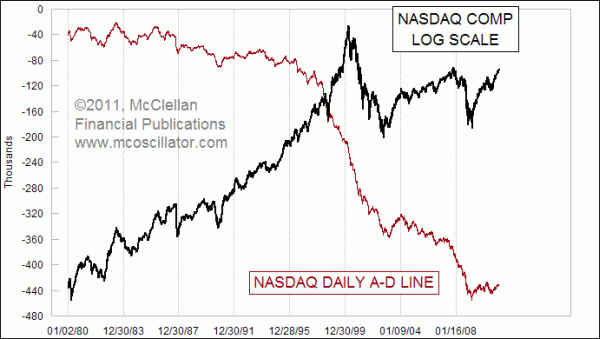
We get asked quite often about the Nasdaq market's A-D Line, and the one point most people are unaware of is that it has a terribly negative bias. While the NYSE's A-D Line is now making new all time highs, the Nasdaq's is not. In fact, the Nasdaq's A-D Line has never made a new all time high. It started downward from the point when Barron's first began publishing the A-D data in 1972, and it has never gotten back to that point, not even during the Dotcom boom of the late 1990s.
The biggest reason for this negative bias is the different listing standards on the Nasdaq. If a low quality company is going to go public and then go broke, it is more likely to do that on the Nasdaq than on the NYSE. And every day that this company (and others) spends going from IPO to zero, it contributes to the declines column.
So when looking at the Nasdaq's A-D Line, it is important to understand that a downward bias is normal. Seeing a new high for the Nasdaq Comp that is not confirmed by its A-D Line is not the same bearish omen that it would be for the NYSE. Down is normal, sideways is actually positive, and if you see it actually move upward, that is an important sign of strength.
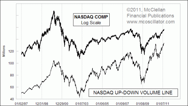
The same thing cannot be said for the Up-Down Volume Line. It is constructed the same way as the A-D Line, but using Up Volume (UV) minus Down Volume (DV). The chart below shows the Cumulative UV-DV Line for the Nasdaq, and it looks a lot like the chart plot of the Nasdaq Comp. This is because most of the share volume gets traded in the bigger Nasdaq companies like Cisco, Intel, or Microsoft. The "IPO to zero" companies do not contribute much in terms of volume, so their voice gets drowned out of the UV-DV Line whereas they each an equal vote in the A-D Line.

The Nasdaq's UV-DV Line looks so much like the price plot that it is of almost no use. The key reason for watching breadth data is to get a message of confirmation or rebuttal of what we are seeing in the price data. If a messenger is only going to give the same message as prices, then why bother listening to it.
The key to understanding the movements of the Nasdaq's A-D Line is not to look at its position, but instead to look at its acceleration. In physics terms, a shift from downward to sideways is actually an upward acceleration. That is why we use tools like the McClellan Oscillator and Summation Index, which measure the acceleration in the breadth statistics.
Tom McClellan
Editor, The McClellan Market Report
Oct 30, 2009
A-D Line Back Near All-Time Highs |
Aug 20, 2010
Disagreement Between A-D and Volume Lines |
Jan 21, 2011
Why Even Fundamental Analysts Should Watch A-D Line |