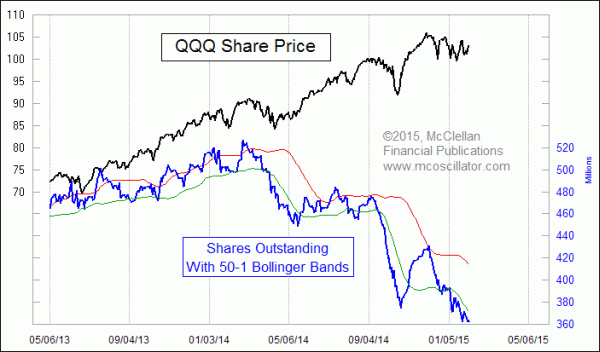
Pessimism Evident in QQQ Shares Outstanding
Free Chart In Focus email
Delivered to you every week
QQQ is the ETF which tracks the Nasdaq 100 Index, and even though that index is only down 2.7% from its recent multi-year high, investors have been fleeing out of QQQ for the past few months.
This week’s chart shows the number of shares outstanding in QQQ, a figure which changes every day as traders and investors become more or less interested in owning that ETF. The sponsoring firm, Invesco PowerShares, issues or redeems shares as necessary in order to keep the share price as close as possible to the net asset value. So watching the number of shares outstanding can be a way of gauging investors’ sentiment, since that number rises and falls in sympathy with prices.
The current level is the lowest since 2010. This low reading is a message of pessimism, just as there can be a sign of excessive bullishness when the number of shares outstanding pops up above its upper 50-1 Bollinger Band. So as we sit here in the beginning of a 3rd presidential year, which are nearly always up years, we are finding a state of great pessimism among QQQ investors. That should help act as fuel for the uptrend.
Tracking this data yourself is not easy, but it can be done. eSignal and QCharts users can access under the symbol $QQQ.SO. It is also available for download, one month at a time, from http://www.nasdaqtrader.com/trader.aspx?id=etfdata. From that page, you have to find the embedded flash link for QQQ, which will open a separate page with one month at a time of its data. The only problem is that the Nasdaqtrader.com folks are not always on top of making sure that the QQQ is included every day. It can be quite frustrating. Or if you are really good at coding in Python, you can scrape the data from this FTP site.
Stockcharts.com does not yet include data on ETF shares outstanding, but that site does feature data on the asset levels in the Rydex series of mutual funds. Use this link to their symbols list for that category. Their charts look different from the ones below, which are from our own meticulously kept data, which is gathered from Guggenheim's own data portal.
Rydex has published asset levels in all of their funds dating back to 1994, and it was Steve Todd who first figured out that one could use that data as a sentiment tool. We picked it up from him, and helped make the use of Rydex data more famous starting in late 1995, adding our own insights such as looking at the Rydex Money Market Fund to see when investors are hiding in cash, and pioneering the use of daily fund flows. Decisionpoint.com (now part of Stockcharts.com) then picked it up, as did other web sites and analysts.
Rydex, which is now owned by Guggenheim Investments, has lost some market share over the years as the ETF industry has grown, but there are still some pearls to be gleaned from that data. Here is a chart showing assets in RYOCX, formerly known as the Rydex OTC Fund, but now known as the Rydex NASDAQ-100 ® Fund. For this chart, we are dividing total fund assets by the fund’s net asset value (NAV) in order to approximate shares outstanding, which Rydex does not report. This data used to work the same way as the QQQ shares outstanding, getting to a high level at tops and a low level at price bottoms, but now it has an interesting twist.
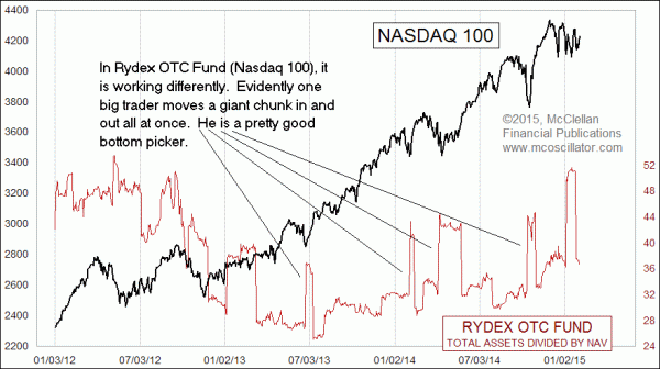
There is evidently a single big investor, or portfolio manager, who is jumping into and out of this fund in huge size, with the swings amounting to around $340 million in a single day. I don’t have proof that it is one single investor or entity who is responsible for these big jumps, but that does fit what the data are showing. And evidently this individual is a pretty good bottom picker, jumping in at very good times, although he does seem to get out too early.
Rydex also has a 2x leveraged Nasdaq 100 fund, whose total assets level is shown in this next chart:
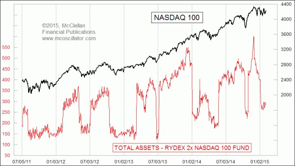
It does a more standard job of marking price highs and lows by going to high or low levels. It is currently showing a bottoming condition for prices.
Like all sentiment indicators, these charts don’t really show actionable “signals”. But they do show the background condition that can give an analyst insight about investor sentiment conditions, and thus what is the more likely direction for stock prices.
Tom McClellan
Editor, The McClellan Market Report
Jan 27, 2012
Traders Like QQQ A Little Too Much |
Nov 06, 2014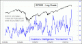
More from Investors Intelligence Data |
Dec 13, 2012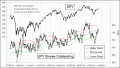
ETF Float As A Sentiment Indicator |