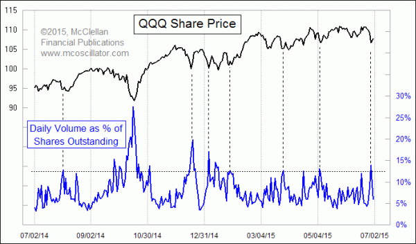
QQQ Volume Spikes on Selloff

Free Chart In Focus email
Delivered to you every week
When the situation in Greece came to a head over the past weekend, traders responded with one of the biggest one-day selloffs we have seen in recent months. It was not actually a big day in absolute terms, but compared to what we have become used to lately, it was a pretty scary day.
ETF traders responded by ramping up the volume in QQQ, the ETF that is designed to match the performance of the Nasdaq 100 Index. Fellow analyst Jason Goepfert of www.sentimentrader.com turned me on to the idea that daily QQQ volume makes for a great sentiment indicator. It rises to a blowoff peak when the stock market is selling off hard. And QQQ volume gets quiet when traders are feeling complacent (or when it is around a holiday, which is another matter).
Jason likes to normalize QQQ volume by comparing it to the volume in all of the 100 stocks which make up the Nasdaq 100 Index (NDX) on which QQQ is based. QQQ volume can vary over time, and so that makes it hard to draw nice horizontal lines to mark “high” and “low” levels. So some normalization is needed.
This week, I am introducing another method of normalizing daily QQQ volume, which is to compare it to the total number of shares outstanding. Back in February, I commented about the rapidly shrinking number of shares outstanding in QQQ, which I took then as a sign that traders were feeling pessimistic and thus the bull market had more room to run. The bull market did run further, but the number of shares outstanding has not really recovered to 2014 levels.
So when we see big volume in QQQ on a single day, perhaps we should not compare that day to prior days in history without some normalization. Measuring the volume as a fraction of the total shares outstanding seems to be a reasonable way of normalizing the trading activity over time. Traders would have trouble trading more shares than those which exist at any given moment, so measuring trading volume as a fraction of existing shares seems like a better way to measure these high volume days as opposed to raw share volume.
We can see in the chart above that days with trading volume greater than about 12% of total existing shares outstanding tend to mark pretty decent bottoms for stock prices as typified by the QQQ itself. When we get into really unusual situations like the Ebola Panic of October 2014, the limits can get extra stretched. So the difficulty for interpretation is gauging in real time whether a Greek debt crisis wiping out whole segments of capital is in the same category of investor panic as the threat of hemorrhagic fever wiping out entire populations.
My leading indications say that THE top is not due for another month. So this high-volume day on Greece worries is a sign of an oversold opportunity within what is still an uptrend.
Tom McClellan
Editor, The McClellan Market Report
May 07, 2015
Eurodollar COT’s Leading Indication |
Apr 30, 2015
Obama’s 2nd Term Much Like 1st for Stock Market |
Feb 05, 2015
Pessimism Evident in QQQ Shares Outstanding |