Stock Market Acting Like We Have a 2nd Term President

Free Chart In Focus email
Delivered to you every week
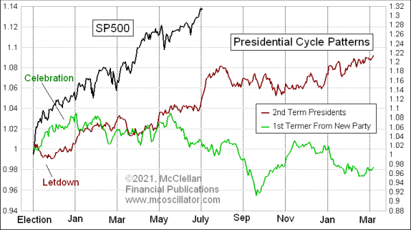
There is a difference in how the stock market typically behaves in the first year of a presidential term depending on whether the incumbent party candidate wins versus the challenger party. We can see that difference in the two versions of the Presidential Cycle Pattern (PCP) shown in this week’s chart.
When a new president comes into office from a different party than the last guy, there is usually some initial celebration, lasting until around inauguration day at which point reality sets in. The celebration wears off once the new guy is installed and then 2 days later he has not fixed everything people were hoping to see fixed.
After then, it is traditional for new presidents to spend the first year “discovering” that conditions are far worse than he told us during the campaign, and that the “only solution” is whatever package of tax or spending hikes/cuts that he is trying to get through Congress. Investors get bummed out hearing that things are worse off, and that shows up in the behavior of stock prices. They all seem to do it. President Clinton in 1993 declared that we were in the “worst recession in 50 years” (despite 5% GDP growth), and that the “only solution” was his $20 billion package of pork barrel spending. What a cute little number. George W. Bush in 2001 noted the economic slowdown after the Internet Bubble collapse, and pushed through a middle class tax cut. So they all seem to do it, but in different ways each time.
When an incumbent wins a second term, or when the candidate from the prior president’s party wins (as in George H.W. Bush in 1988), then he does not usually spend the first year blaming the predecessor for everything being such a mess. So generally speaking the stock market does better during an incumbent party president’s first year of a new term.
That is what shows up in the difference between the two PCP plots in this week’s chart. Interestingly, the two plots do come back together during the second year, which is off the right side of this limited chart. The difference is in the first year, which is why I configured the chart this way to show that difference.
The more interesting point right now is that the SP500 is acting much more like the 2nd term president plot, even though we have a first term president (Biden) from a different party than the last president (Trump). That’s rather curious. I am not just talking about the upward slope of the SP500’s price plot, but also the correlation to the minor structures in the 2nd term presidents’ plot. If the market was going to follow the normal 1st term president plot, then we should have seen a top in May and a summer downturn, but we are not seeing that.
Perhaps it is the Fed bending prices higher with QE4. Perhaps it is a different style of campaigning for reforms that President Biden wants, a tone that does not bum out investors as much. Whatever is the explanation, it is an interesting change in the normal first term behavior to take notice of.
If the SP500 continues to follow the 2nd term Presidential Cycle Pattern, then a top lies just ahead, followed by the normal seasonal weakness into autumn. And the 1st term PCP also shows a top just ahead, albeit more into early August than in mid-July, which is not a great distinction.
Tom McClellan
Editor, The McClellan Market Report
Oct 01, 2020
Presidential Cycle Pattern Calls for Choppy October |
Dec 06, 2019
Presidential Cycle Pattern and an Election Year |
Apr 30, 2015
Obama’s 2nd Term Much Like 1st for Stock Market |