Visualizing Spending and Revenue
Free Chart In Focus email
Delivered to you every week
Looking at federal spending and tax receipts as a percentage of GDP has become a hot new activity lately. It's something that I have spent a lot of time on for the past several years, and shared with our readers. A fresh look is appropriate now that it is getting wider attention.
Presidential candidate Mitt Romney has been getting a lot of attention for his call to cut federal outlays to just 20% of GDP, and to also balance the budget. Washington Post columnist Ezra Klein characterized this as "severely conservative budget promises". But the real problem is that neither man understands enough about the math involved, although Gov. Romney deserves credit for at least thinking about moving the numbers in the right direction.
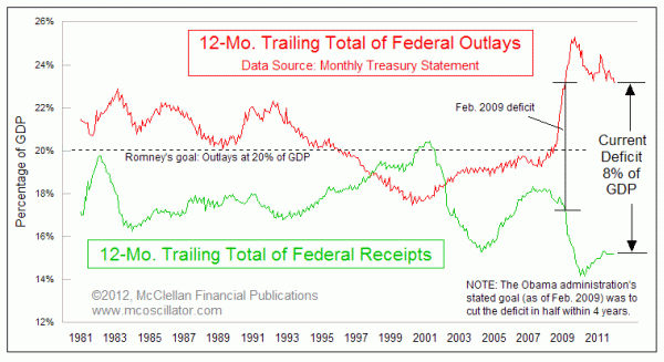
This week's chart takes another look at a chart I showed back in February 2011, comparing total federal receipts to total outlays, each expressed as a percentage of GDP. The good news is that the total outlays over the past 12 months have fallen to their lowest level since February 2009. The bad news is that this is still 7.96 percentage points above where total receipts are.
It is tempting to say that total receipts just need to get jacked up to meet expenditures, and then the problem would be solved. One problem with this logic is that the U.S. has never in its history been able to get tax receipts up above 20.4% of GDP, which was the peak seen in February 2001. So trying to achieve a level of taxation high enough to meet current expenditures would involve going where no economic era has gone before.
The other problem with this logic is that taking tax receipts up too high hurts the economy, and thus hurts the very engine of generating tax receipts that everyone is counting on. Congress seems to almostget this, which is why there has been wide support for keeping the payroll tax cut in place for a while longer, even though it continues to increase the size of the total debt.
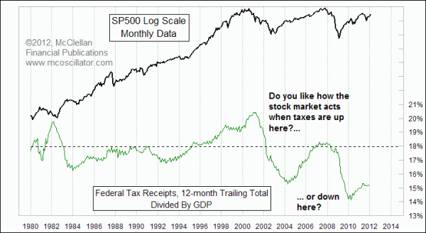
Historically, anytime that total federal receipts has gone up above 18%, it has hurt the stock market and thus the overall economy, including the last time that it happened back in 2007. One rebuttal to that point holds that the U.S. was able to tolerate taxation up as high as 20% in the late 1990s, with no adverse effects on the economy. But that rebuttal misses several important points.
The stock market continued upward during the late 1990s in spite of that high tax collection rate, moving upward all the way until 2000, assuming you believe the behavior of the major averages. In reality, the pain was already being felt long before then. The NYSE A-D Line peaked in early 1998, and did not reach bottom until 2001 when the first of the tax cuts went into effect. And the total number of stocks listed on the Nasdaq peaked at 6136 all the way back in December 1996. It is now down to less than half that amount. The dismantling of the tech bubble started at that December 1996 peak in listed issues, and it continued all the way into the peak of the Nasdaq Composite in March 2000. Destruction of capital due to those high tax rates was already at work long before it became evident in the major averages.
Aside from that exceptional episode, recessions have historically begun once federal receipts get up to above 18%. So any plan to have federal expenditures set at 20% is 2 percentage points higher than the level of tax receipts which is proven to push the country into a recession. It is not a workable plan for balancing the budget, let alone starting to pay back the $15 trillion debt we have amassed and will be leaving to our grandchildren.
A more realistic plan would be to set federal expenditures at 16% of GDP or less, and using any surplus to pay down the debt, thereby shrinking government's share of GDP and increasing the private economy's share of GDP. That has been proven historically as a way of stimulating economic growth by taking workers whose efforts would have been attributed to the government sector, and putting them to work in the portion that supports the government sector.
Hopefully those in power (or hoping to be) will one day wake up to the realities of the math.
Tom McClellan
Editor, The McClellan Market Report
Feb 11, 2011
Congress Still Does Not Get It |
Oct 27, 2011
Negative Real Yields, Too Much of a Good Thing |
Sep 02, 2011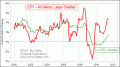
Weak Housing Data Conceals Real Inflation |
Jun 10, 2011
Architecture Billings Index Forecasts The Economy |