Volatility and Interest Rates

Free Chart In Focus email
Delivered to you every week
Why is the VIX spiking now? Because now is when it is supposed to do that.
Volatility and interest rates have an interesting relationship, going back many years. Higher interest rates pull money away from the stock market, and thus make it so that prices have to travel farther to find liquidity, after a positive or negative stimulus.
The word “volatility” gets thrown around a lot in our business. We should all remember that it gets borrowed from the world of chemistry. It refers to the amount of reaction you get for a little bit of input. Asphalt is made from tar, which is flammable. But if you drop a lit match onto asphalt, the match will flame out. Asphalt is not very volatile.
If you drop a lit match onto a puddle of 30-weight motor oil, it might burn, or it might swallow the match. If it burns, it won’t do so very fast. 30W oil is NOT very volatile.
Now if you drop a lit match onto a puddle of gasoline, you’re going to need to grow some new eyebrows. You’ll get a big FAWOOMP!!, as well as a talking-to from the firefighters who come to bandage you up. Gasoline is very volatile.
In each of these cases, the input stimulus is the same… a lit match. The response varies, though, according to the nature of the organic chemistry of the medium into which the match is dropped.
The stock market is very much the same. A news item which might get no reaction in some periods gets a huge reaction in others. The volatility of the market varies, and for reasons which seem entirely mysterious on the surface. But if we find the key to unlock this mystery, the variability of volatility starts to make more sense.
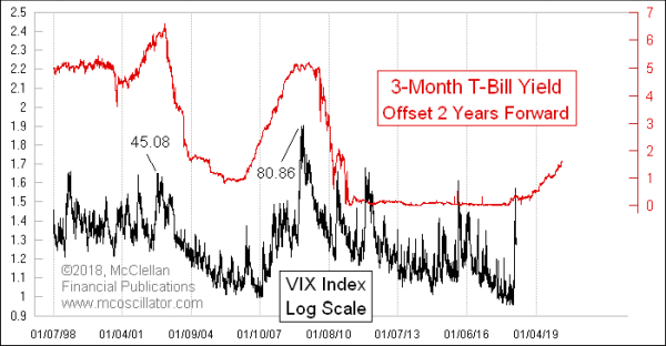
This week’s chart compares the 3-month T-Bill yield to the spot VIX Index, which is shown on a logarithmic scale. This is a relationship I uncovered years ago, and which I have talked about in our twice monthly McClellan Market Report. But it has not been ripe to talk about here until just now, because the Fed has had its boot on the neck of the bond market until just recently. By finally allowing short term interest rates to start rising again a couple of years ago, the Federal Reserve set the stage for volatility to start rising now.
Movements in the VIX seem to lag movements in the 3-month T-Bill yield by about 2 years. We are now just over 2 years advanced from the Dec. 16, 2015 FOMC meeting, when the Fed finally allowed the Fed Funds rate to be lifted from the “0 to 0.25%” target. And right on schedule, we got a volatility spike on the 2-year echo point of that change.
Why is it that 2 years is the magical lag time? I really don’t know. But I do know that a 2-year lag time has been a good explainer of the VIX’s movements for the last couple of decades, and so at some point I stop questioning it, even if I don’t have the “why”.
The chart plot of the 3-month T-Bill yield shows an upward rise, but it really did not get started until December 2015. Adding 2 years gets us to December 2017. The spike in the VIX was just over a month late, coming in late January to early February 2018.
Now that we have that spike, what’s next? The plot of the 3-month T-Bill yield says that the VIX should pause for a while, and then start trending upward late in 2018. We have been through higher T-Bill rates before, and we’ll get through this upcoming episode. But the point to understand is that the era of single-digit VIX numbers is behind us.
Tom McClellan
Editor, The McClellan Market Report
Feb 03, 2018
VIX Spike Takes it Above All of its Futures |
Jul 27, 2017
How VIX Ends A Long Run of Low Values |
Dec 15, 2017
Confidence, and What Comes With It |