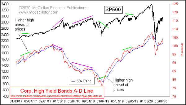
Higher High for HY Bond A-D Line
Free Chart In Focus email
Delivered to you every week
Stock prices are doing their best impression of a V-bottom rebound, even if it is a somewhat lopsided V shape. For much of this rebound, it has been possible to argue that this is “just a bear market rally”. The higher that prices go, the harder it is for adherents to stick by that assertion.
The big worry is over whether the Fed can throw enough liquidity at the financial markets to overwhelm the economic damage from the Covid Crash. This week’s chart says that the Fed is prevailing at the moment.
High yield bonds, AKA junk bonds, trade a lot more like the stock market than like T-Bonds. And they are terribly sensitive to liquidity, either good or bad. So the HY Bond A-D Line can convey important information about the health of the liquidity stream in ways that the price indices might not know yet.
When there is a divergence between this A-D Line and the SP500, it is a good idea to listen to that divergence. Such divergences appeared twice in 2018, saying that there were liquidity problems that year. But then after the Dec. 24, 2018 price bottom, this A-D Line made a higher high ahead of prices. It has continued to look as strong as prices or stronger all the way up to the February 2020 top.
It is a little bit disappointing that this indicator did not show us a divergence at that February 2020 top. The decline from that top was not a true liquidity event, but rather a reaction to exogenous forces originating from outside the financial markets and banking system.
Now that the market is into the rebound phase, this A-D Line is back above its 5% Trend (AKA a 39-day EMA, for those who don’t use the originalist terminology as we do). And this A-D Line is now making higher highs. It is not yet a new all-time high, but that is not really relevant at the moment. It is doing well enough to be rising rapidly and making higher highs for now.
Here is a longer term chart, showing the entirety of the FINRA dataset:
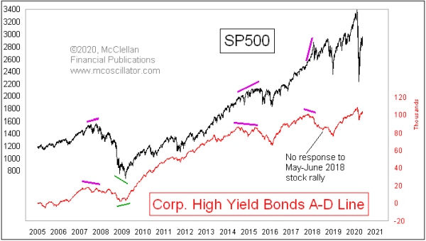
When there are really big divergences between this A-D Line and prices, that conveys a message of a bigger turning point for prices. Such divergences appeared at the tops in 2007 and 2015, and also at the short-VIX blowoff top and crash in January 2018. Each of those divergences led to important illiquidity events for the stock market.
We are now in the throes of a different kind of market event, not brought about by market forces on the liquidity stream. The Fed is meeting that threat with a torrent of liquidity, which may not necessarily be the right solution, but it is the one they are going with. And the message from high-yield bonds is that the Fed’s efforts are working.
Tom McClellan
Editor, The McClellan Market Report
Jun 06, 2019
High Yield Bonds Back to Bullish Mode |
Jan 24, 2019
Junk Bond Strength is Bullish For Stocks |
Oct 05, 2018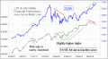
A-D Line Diverging |