New Use for Correlation Coefficients
Attached is a chart showing a fairly new indicator I developed. I don't know if anyone else has ever thought of doing this before.
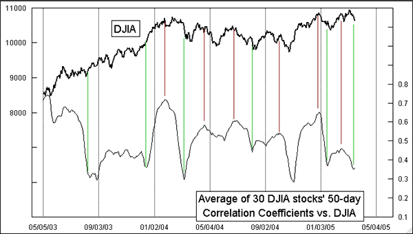
To construct it, I first calculate the 50-day correlation coefficient of each of the 30 Dow stocks versus the DJIA. The indicator is the daily average of those 30 stocks' correlation coefficients. It turns out that this indicator gives pretty good indications of what the prevailing trend direction is. It mumbles sometimes, like any indication of trend direction, but overall it is pretty good. It turned up on Wednesday, March 16, which is a statement that the impending trend direction is upward (subject to immediate revision, of course!).
Interestingly, this indicator has behaved differently at certain times in the past. During the downtrending years from late 1999 through early 2003, this indicator moved inversely to prices. It correlated inversely during 1990, but positively from 1991-1993. It correlated negatively during 1994, but positively from 1995 to early 1998. That suggests to me that the way in which this indicator behaves relative to prices may itself be an indication of whether we are in a bull or bear market.
I have not yet tried to build this indicator for any other groupings of stocks.